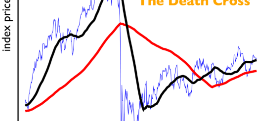
The generalized death cross: 44,701 exciting ways to lose money!
Only liars manage to always be out of the market during bad times and in during good times.
Burton G. Malkiel
As shown previously, it’s pretty easy to show that there are times when a particular death cross strategy will not work. It’s also (reasonably) easy to compute 44,850 different death cross strategies to see whether those will work over a 62-year period. As a reminder, the class of strategies we’re looking at is as follows. When the X-day trailing average falls below the Y-day moving average, sell. When the X-day average goes above the Y-day average, repurchase. Traditionally, X<Y because something-something voting machine weighing machine behavioral finance fuck if I know.
As in the first installment, daily S&P 500 data were pulled 1 over the time period 04-Mar-1957 through 17-May-2019. The start date is where the S&P began using 500 stocks. The end date is 205 years after the signing of the Norwegian constitution, and also the day I happened to pull the data. A few processing details before we get to some of those sweet, sweet contour maps.
- Price at closing was used, and it is assumed that you get exactly the closing price of the day. This is a deeper assumption than it might sound like. Before the mid-1970’s2 it was not trivial to mimic the behavior of the index, let alone buy or sell the entire index at the closing price with zero bid/ask spread.
- The return to which each strategy is compared is the market return, without buying or selling. There is therefore no need to account for inflation, because both are affected equally.
- Transaction fees are assumed to be as small as I can reasonably justify 3 which is an advantage to the active trading strategies. This assumption is probably reasonable at present. It is less accurate the farther back you go, and it means that a strategy which looks like it would have been effective may not have actually been viable.
- Capital gains taxes are not assessed.
- Dividends and return on cash are not included.
The assumptions of low fees, zero taxes, and zero bid/ask spread are favorable to the more active death cross strategies. Including dividends and return on cash has a mixed effect which is dependent on a number of other assumptions. Because the buy and sell indicators in the strategy are price-based, I’ll concentrate on price returns for now and come back to this at the end.
“General Deathcross” will be my stage name when I finally join GWAR.
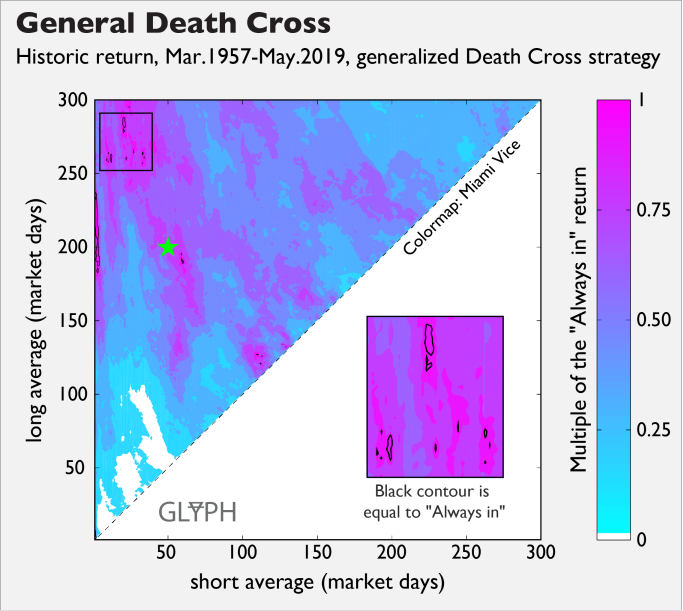
The above is not a part of an interior shot from Rico Tubbs’ house, but instead indicates that on a price return basis, the number of deathcross strategies that might work are rare—149 out of 44850 or about 0.3%. The thin black contour indicates that strategies inside that contour historically performed at breakeven or better relative to the always in strategy. Because the contours were computed using assumptions which were favorable to trading more frequently, lying inside one of the black contour regions is a necessary condition for improved return, but probably not sufficient.
What would a graph that indicated that these strategies were a good idea in general look like? For starters, there would be a lot more of that eyeball-searing magenta color on it. Even if the image was no more magenta on the whole, you would like to see large contiguous regions of the black contour to convince you that a strategy in the middle of that region which has performed well historically is likely to be robust. As an example of the potential fragility of an apparently working strategy, the 200/3 strategy yielded 113% of the always-in gains, but 200/5 yielded 56% relative to always-in. Is there something specific about 3 days that makes it literally twice as good as 5?
A fabulous journey to WTF Island
You would therefore like to find that the breakeven-or-better regions correspond to some working theory or theories of why these strategies might work. As an example, you might hypothesize that when a 2-week average dips below a 1-year average, a person who re-evaluates their stock market exposure every pay period might not put money in this paycheck. You might further guess that that cycle is self-reinforcing, so you should wait for some sign that whatever feedback loop perpetuates it gets broken before you buy back into the market. You might consider that rejecting a successful back-tested strategy on the basis of a good story is questionable, but what you’re really trying to do is convince yourself that a given breakeven contour isn’t simply lucky. The time period 1957-2019 is quite a while, but out of 49000+ strategies, there are bound to be some false positives.
As an interesting example, notice that there are some small blips of positive returns near (110, 125). It might not be immediately obvious, but this is REALLY WEIRD. As the short average approaches the long average, the difference between the averages is increasingly based on old events because both averages contain the same information between (in this case) 110 days ago and the present. If this is indeed a good trading strategy, it suggests that something happened consistently about 110 days before bad events. This region was much larger and more continuous until the market dip and recovery in late 2018-early 2019, so much so that I mentally referred to it as WTF Island. The shrinkage of WTF Island is presented in the figure below.
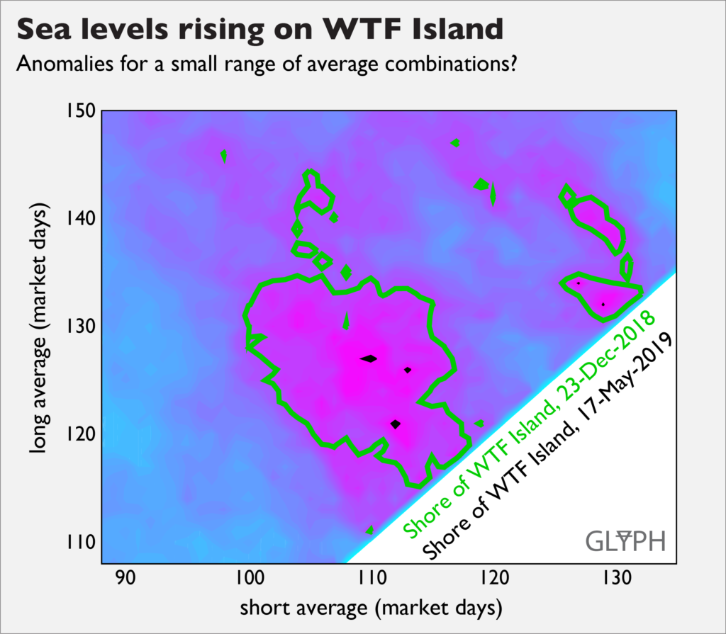
So do the remaining little bits of WTF island represent a good strategy? Back-testing like this always has limits, but because 6 months of additional data turned Atlantis into Rockall AND there’s not a great working theory to support it, my guess is no.
So how much of a pain in the ass is this?
Okay, so Aren thinks this is pretty questionable, but he’s also just, like, some Internet jerk who makes plots that look like Max Headroom barfed on them. There are other Internet jerks who do tout the idea, and maybe making trades makes you feel like you’re exercising some control over the process, like rooting for a sports team.4 Control that you lack in the rest of your life! You crave it!
My biases notwithstanding, let’s say you develop a working theory that you like that corresponds to a region which is breakeven-ish, and you’re determined to do this thing. How much effort is it to actually execute one of these strategies? As it turns out, you don’t have to trade tremendously often for most strategies, as shown in the figure below.
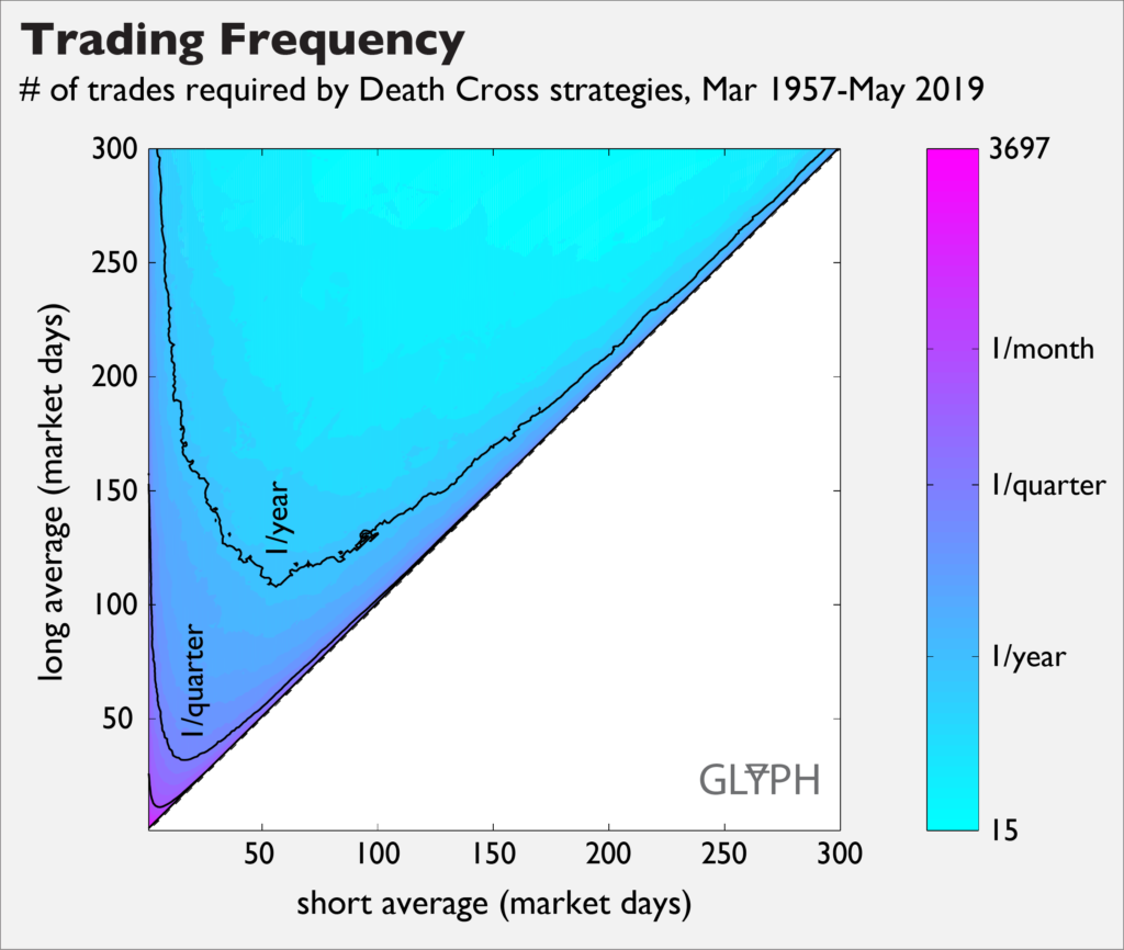
The little unlabeled contour near the origin is one trade per month, and most of the map corresponds with strategies that trade less frequently than once per quarter. This is nice in many ways, not least of which is that making these moves does not become a full time job. It also means that the frequency of trades is broadly consistent with the rate at which reliable information (e.g., quarterly earnings reports) becomes available, and that fees and sell errors shouldn’t be an enormous problem.
In contrast, the most active trading strategy, in the very corner at (1,2), requires 3697 buy/sell pairs, or approximately one transaction every two market days. This is…a lot. Furthermore, despite the fact that the strategy actually looks pretty successful in back testing, it’s also getting maximum benefit from all of the pro-trading assumptions. A full sensitivity analysis on this strategy seemed outside the scope of this article, but as anecdata, increasing the transaction costs from the minimal 0.00207% used here to a still-justifiable 0.05% wiped out the strategy’s improvement over baseline. To its credit, baseline might be better than making it up on your own5.
How often are you in the market?
Fraction of time in the market is a crude proxy for assessing the dividends question. If you’re not holding stock, you don’t get the dividends. Reinvestment of those dividends is a big deal, so a strategy that pulls you out of the market for large periods of time may be problematic, even if you stand to profit from the sale/repurchase pair. The figure below indicates that the deathcross strategies all keep you in the market between 50% and 75% of the time.
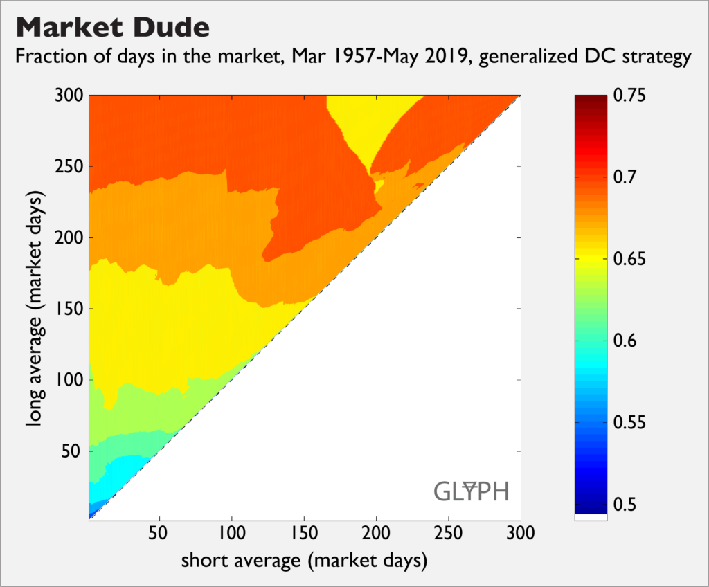
This band is much tighter than I would have thought, considering that you would be making between 3697 and 15 trades over the observed period. You’ll also notice that the fraction of days is noticeably not smooth, and in particular is much less smooth than the number of trades. This is real, and it is not due to using a small number of contours. The reason for it is that as the number of trades goes down, each one that you do or don’t make represents a significant fraction of market days.
Dividends and return on cash
“But perhaps there is a non-crude way of assessing dividends”, you say hopefully, as I once did. The trouble is that introducing returns on cash and dividends introduces the need to make a number of other assumptions. For example, how many days does it take to realize a return on cash? If you sell at the closing price on Wednesday, do you get one day’s worth of cash returns by the end of Thursday?
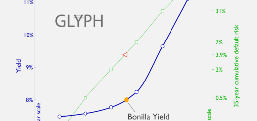
And what is “cash”, exactly? In the figure below, I’ve used the yield of the one year Treasury, held to maturity. These data were continuously compiled by the Federal Reserve 6 over the entire time span of interest, and was reasonably close to other candidate rates which were not compiled over the full range, so I went with it. Also, the Mets will be paying 8% interest to Bobby Bonilla on $5.9M until 2035, which is a fantastic thing that I feel compelled to bring up whenever possible.
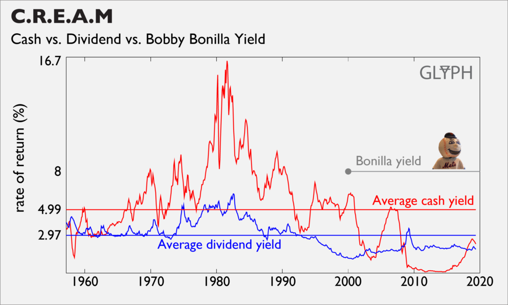
For most of the time span, cash yield handily beats dividend yield, but not so much lately. So when you perform a back-test, do you assume that the spread in these yields looks like the present day? If you use the historical yields, you find that a lot more death cross strategies make money—15.9% of the map vs. 0.3%–but unless you think you’re going to get 14% in a bank account at some point, you probably shouldn’t put a lot of faith in those strategies. If you do think you’re going to get those types of returns on cash, you’re implicitly guessing that something pretty unusual is going to happen and you should probably trade on that basis, rather than some algorithm with a scary-sounding name.
The working theory of these strategies is ultimately a guess about what other people will do, and the map indicates that that’s not something you can do robustly. Other inputs like yields on cash and dividends are as or more important than the averaging periods. And so, back to where we started:
“Is it possible to intelligently manage my equity exposure by carefully studying a large number of fundamental corporate and macro inputs, then adjusting my risk profile in accordance with those variables and my investment thesis?”
Yep! I mean, probably. But the death cross is no magic algorithm, so you’re down in the muck with the rest of us.
- https://finance.yahoo.com/quote/%5EGSPC/history?p=%5EGSPC
- https://en.wikipedia.org/wiki/Index_fund#Origins
- Only the SEC fee at time of writing, no FINRA, no broker commission
- And gambling heavily on it.
- https://papers.ssrn.com/sol3/papers.cfm?abstract_id=219228
- https://fred.stlouisfed.org/series/GS1